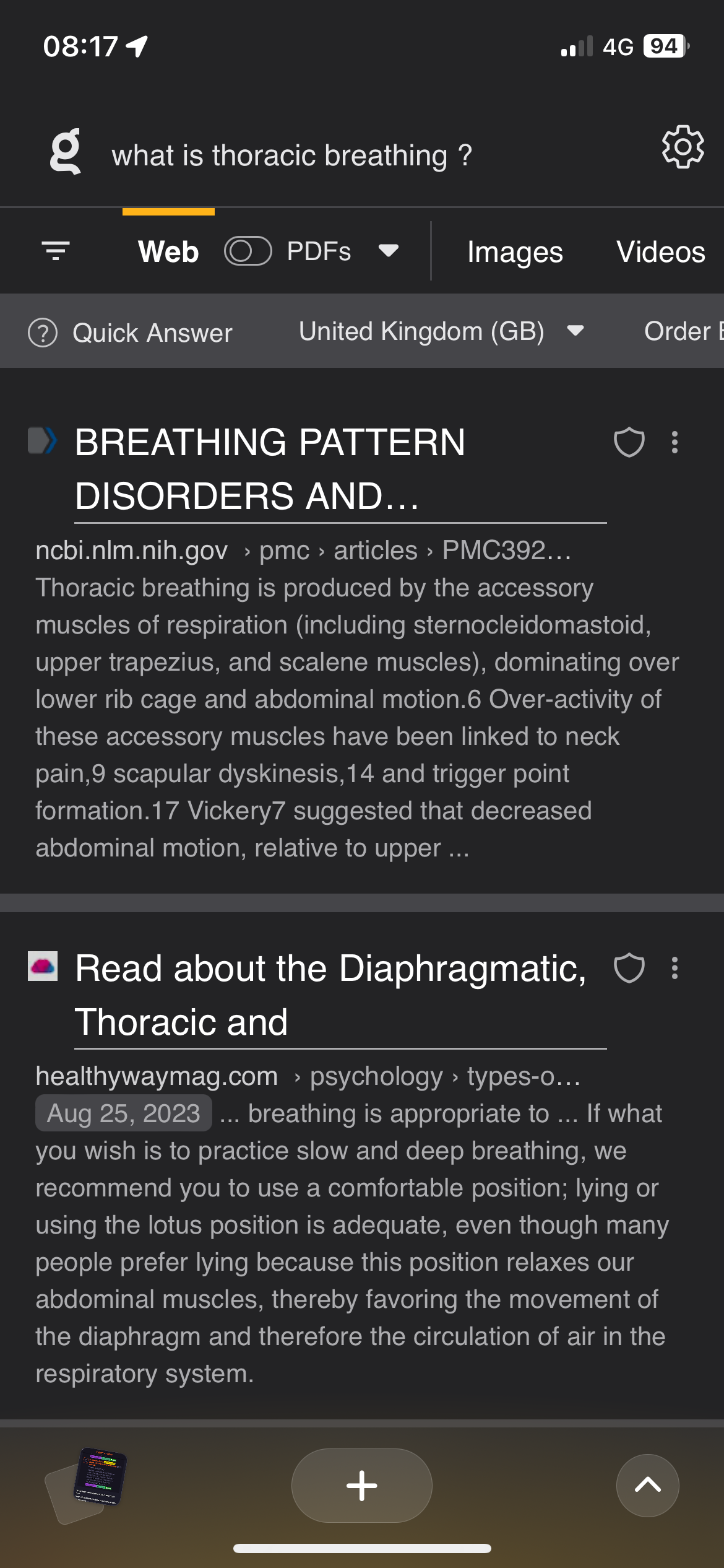
In my personal experience, Kagi still lacks behind Google in relation to search results organisation and quick answers.
I don’t mean Kagis AI quick answer.
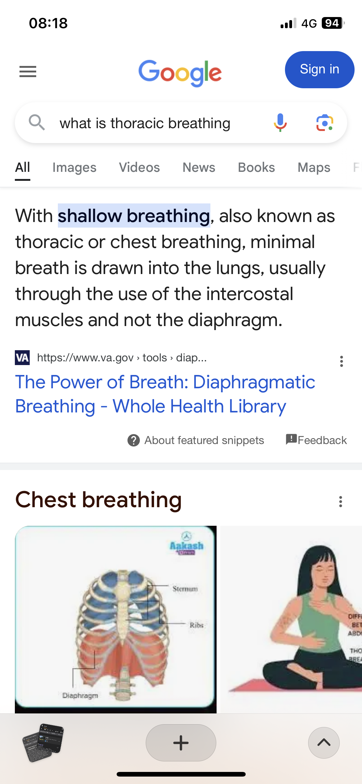
Googles feature of having a box at the very top with the answer to your question displayed (referenced from the website) and highlighted to the specific point is very useful for!
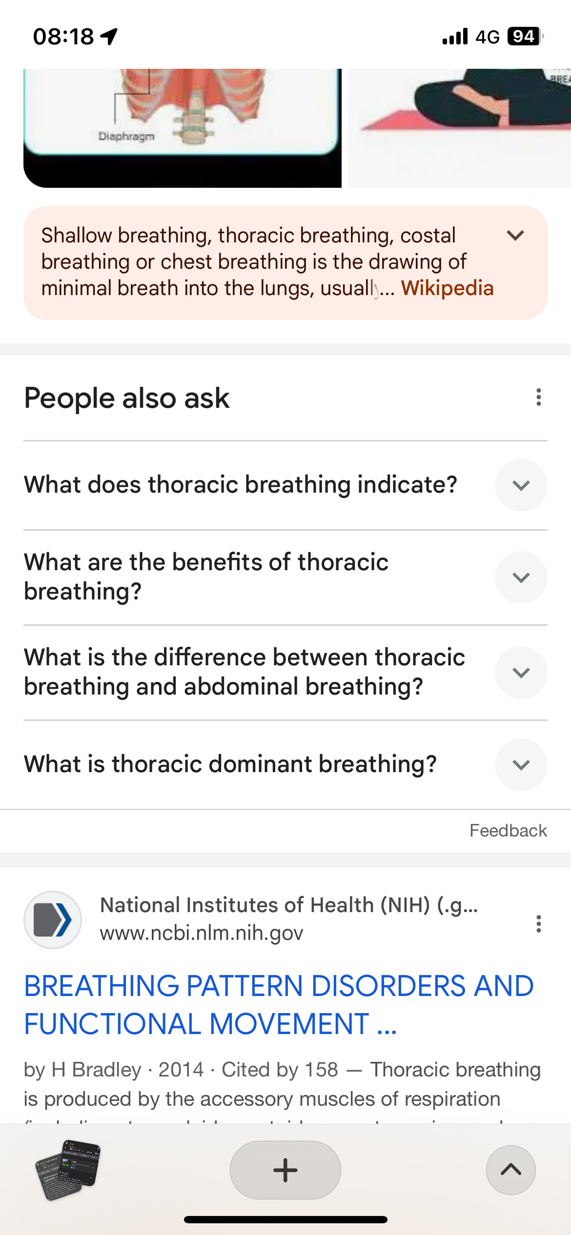
Moreover, the “people also ask” toggles are extremely useful and is where I get most my answers from.
I would love for Kagi to implement similar features and make them towards the top so I don’t have to scroll down.
As seen from the images attached, Google presentation is easier and quicker to get your answer. And the people ask section is great because often I asked my question in the wrong way and ‘people also ask’ shows similar questions that lead me to the answer I wanted. 


If I want a quick search where I’m wondering what something is, or am unsure of something, I’d search to get a very quick answer at a glance rather than dig through webpages.
I’d rather it be the way Google presents it as an extract from the webpage, highlighted, answering my specific question, rather than a generative AI response. Cause that way I know it’s from a website, I see where in the website and i can click to research further and verify if I wish to do so.