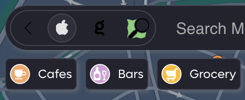
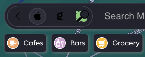
When viewing Kagi maps, if you click on the settings icon to the left of the search input, it expands to show collapse icon, Apple logo, Kagi logo and OSM icon.
These icons are in black so they are hard to read when the maps are open in dark mode as well.
Icons should be lighter in dark mode. See the screenshot for how it renders.
Chrome:

Orion:
