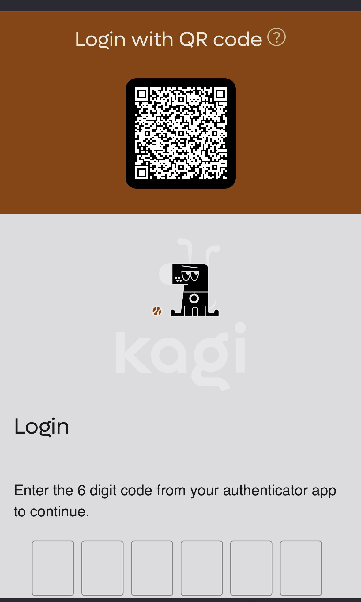
Fairly straightforward issue. Every time the page loads and I pull up my 2fa code I start typing and then look at the screen to realize the input was not focused so no text was entered. 2fa is already relatively cumbersome so making the process as smooth as possible is important for user experience. One thing that is done well on your 2fa page is auto submitting the code once fully typed, this does streamline the experience a lot!
One more suggestion on the 2fa page on mobile would be to reduce the visual significance of the Kagi logo on this page; perhaps move it side by side with QR code or below the code input. But I do think having the code input closer to being vertically centered would greatly improve the visual appearance of this page. Attached you can see the code input is rendered at the very bottom of the screen (on iPhone 15pro for context).
