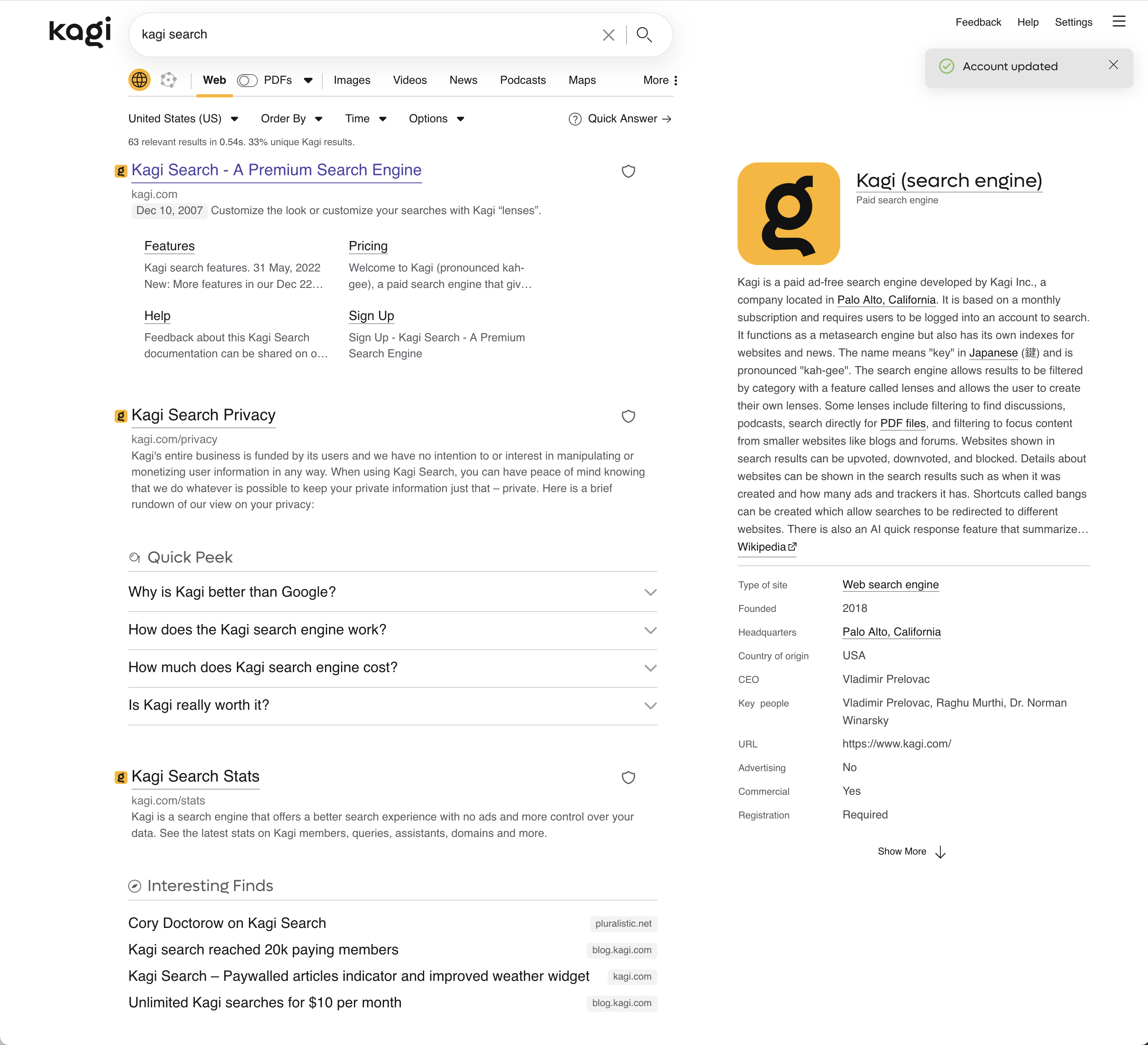
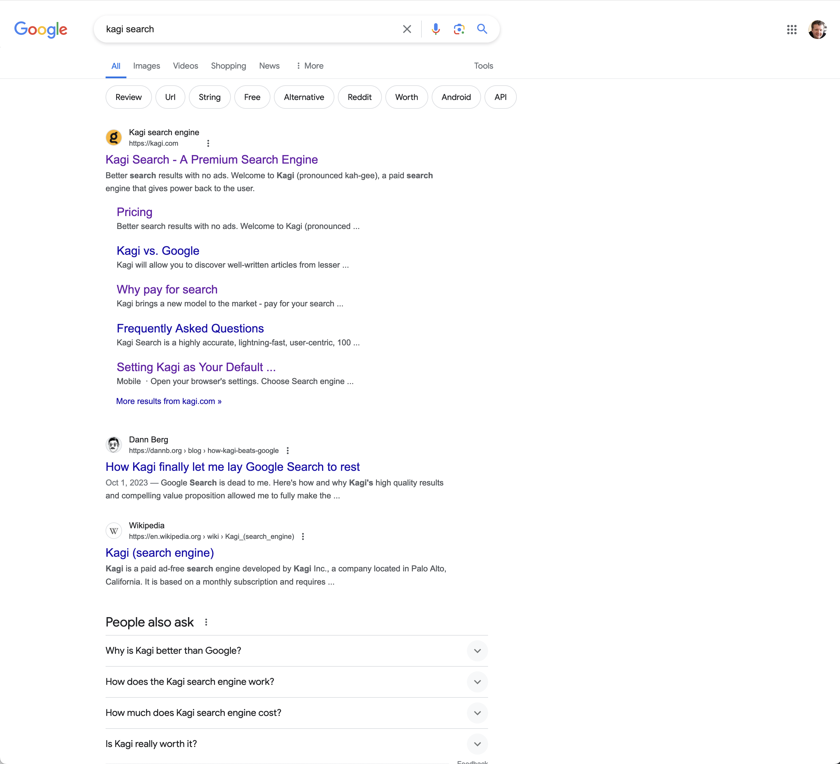
I'm really loving Kagi. Searches are fast and I can filter out what I don't want to see.
However, one thing I do miss from transitioning from Google is that Google is easier to read. Kagi's all black/gray results screen makes the website titles blend into the descriptions. With Google's titles being blue, it's easier to read.
I'm not saying copy Google at all, but it would be much easier to see if there was more colors and larger favicons on the screen.
Search result titles should be in blue or have an option for users to be able to select the color, turn underlining on/off, etc.