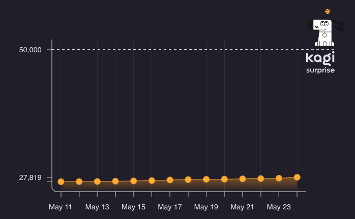
Currently, the graph for member count is very warped due to the indicator at the top for Kagi Surprise

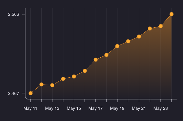
This makes it extremely difficult to discern trends, and makes it look as if member count is stagnating when it is actually increasing. Compare it to the chart for families, and you can see the stark difference.

My suggestion is to zoom in to the graph. This could be acomplished by doing one of two things, in order of which I think would be the best solution
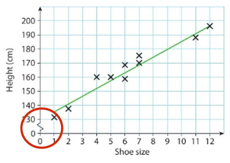
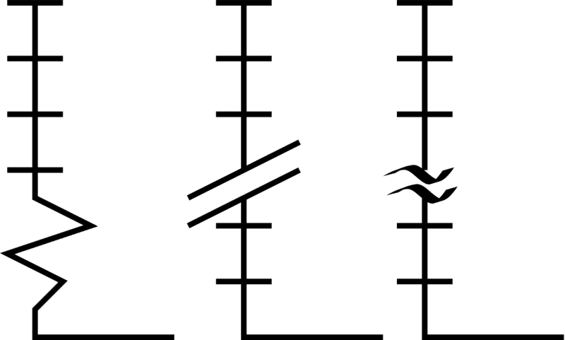
Add an axis break (usually a squiggle or zigzag pattern) to the vertical axis between where the top of the data ends, and Kagi Surprise.
Remove Kagi Surprise from the graph
Examples of axis breaks ( from this:


This would provide a more accurate depiction of the change in members over time