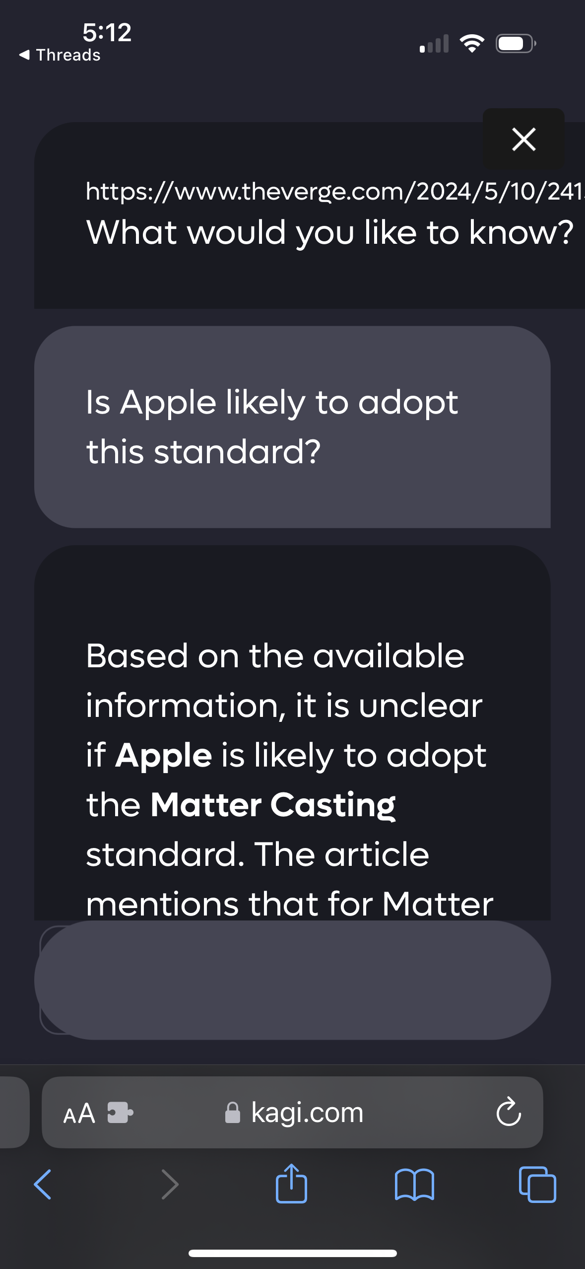
On iPhone, the “discuss further” UI is so large that little text fits on a screen. 

I would like the UI to be denser so that more text will fit on the screen. This will improve usability. To be honest I don’t know if this falls under bug or feature request.