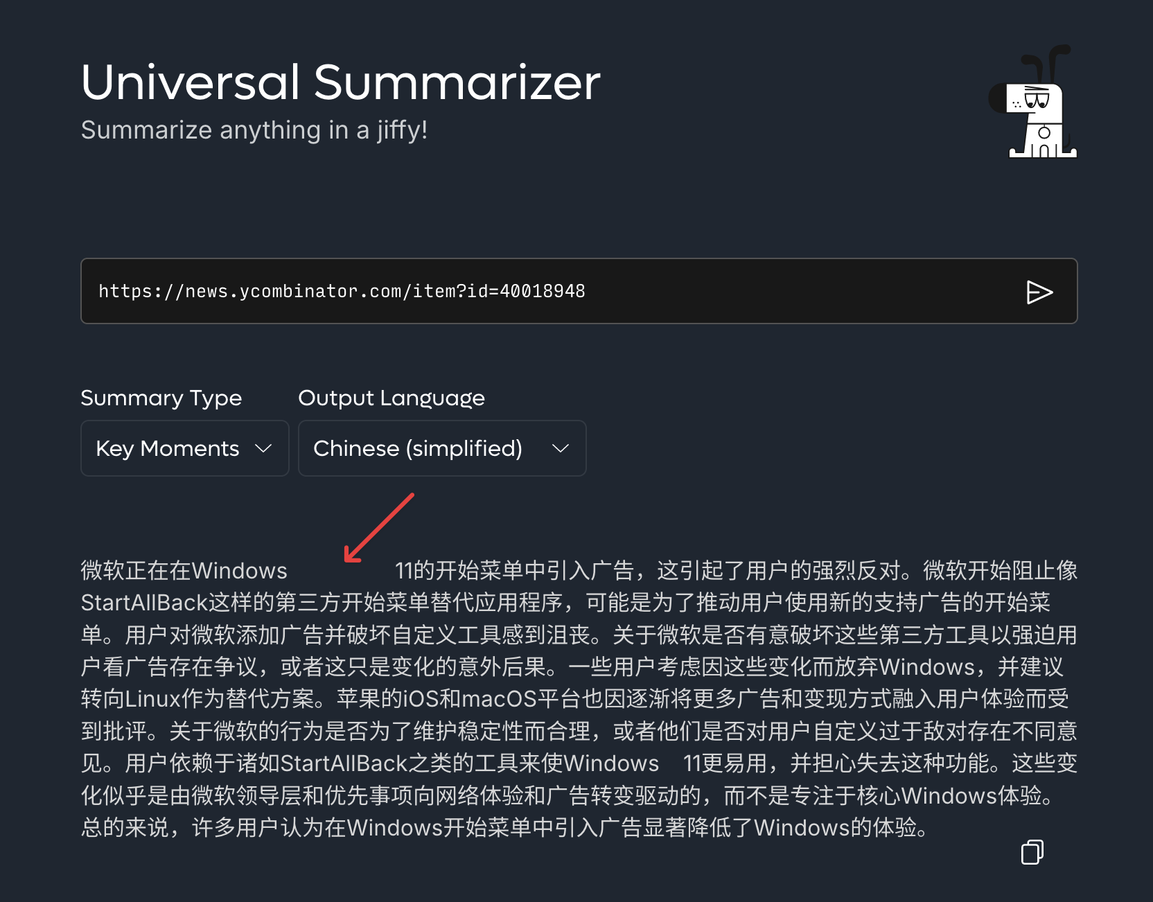
Currently the Summarizer uses a justified layout for its outputs, which is less common for online content than flusing-left and may cause unpleasing variation of length of whitespaces in multilingual output.
As an example, note how the space between "Windows" and "11" was stretched in the following output in Chinese.

The text-align of the element containing outputs should be set to left instead of justify.