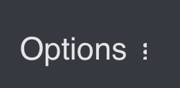
The 3 dots next to Options to this day sometimes makes be believe that there are further options if I click on them specifically.

I think an icon like this would be better, since the button (which I would prefer to be highlighted as a real button on hover at least, same with all other buttons, for UX and accessibility reasons) works similar to Lenses - it folds something in and out:

Also I would make the icon point downwards to fold the options out and upwards to fold the options in.