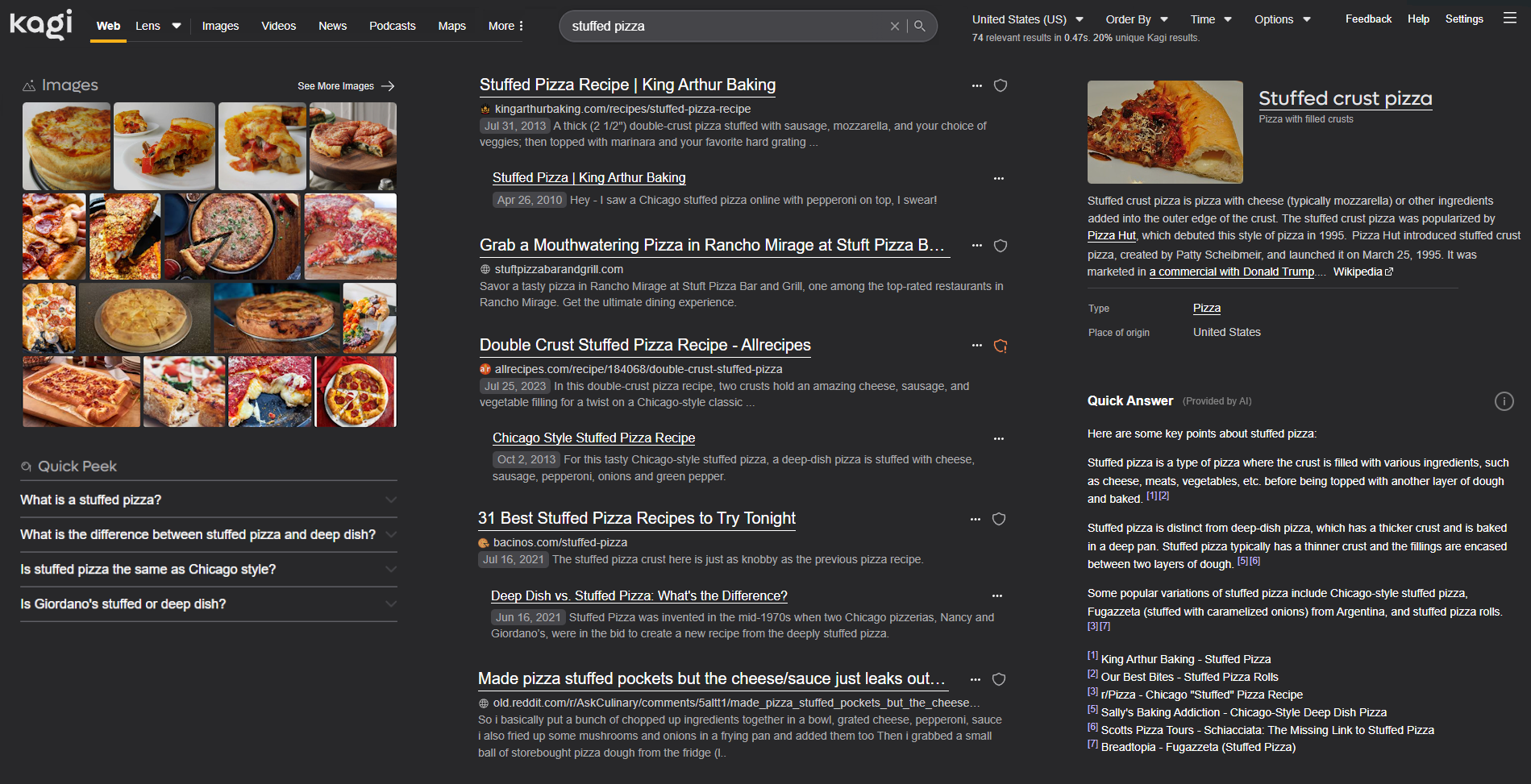
The current design of search results pages seems optimized for portrait displays like mobile phones, with the majority of information relegated to a column that makes up only a small section of a landscape desktop display.

I would like to see an option for an informational, more efficient layout that does not leave so much screen real estate empty, such as:

I can see this being toggleable in settings under the appearance section for users that would like a more informationally-dense search results page.