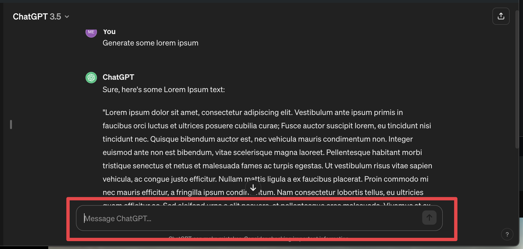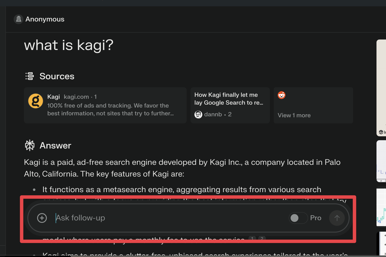
The container for the assistant's follow-up input should be position: fixed to keep it on screen, rather than always having it below the last response. Sometimes I'd like to scroll up to read through a previous response, but then immediately start typing my next question.
Scrolling back to the bottom shouldn't be required. This layout choice is what a number of others in this space use and is better, in my opinion.
ChatGPT:

Perplexity:
