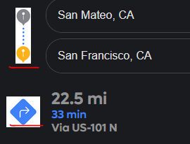
In maps when using a dark theme, some icon are also dark or have a white background around them. This causes the icons to be difficult to see or visually unappealing.
Examples:


I would expect the icons to be a light color and not have a white background when using a dark theme.