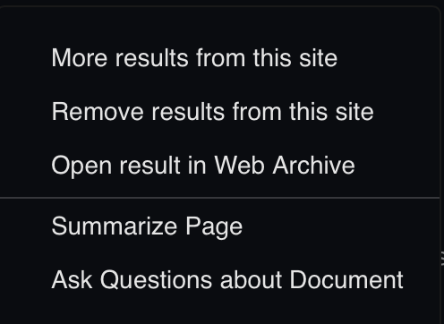
The actions menu (within the ... icon next to each result's title) has grown a bit and it takes a moment to read through the items each time to decide what to do. It would be nice if each one had a visually distinct icon so users can quickly find the item they already know they want without having to read the list each time.
Here is the menu:

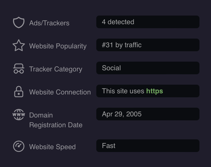
For some semi-prior art, Kagi's result domain information popover has icons for its details:
