Browsing6853 Most people who would benefit from this feature would probably not find it in the settings.
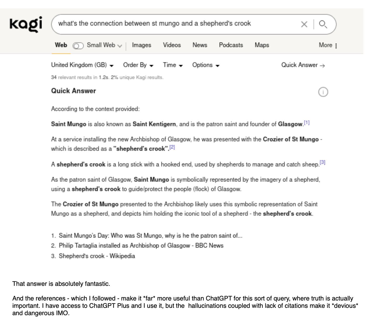
Sharing feedback I got today that is relevant to what is being discussed here.

I've seen in many personal interactions with Kagi users that most do not even see "Quick Answer" link and have never used it. Even some very tech savvy people. And then seeing it in action is a transformative experience.
Here is another feedback.

So it would be hard (borderline irresponsible) to ignore a solid use case for certain types of queries where summary of results is indeed a superior search experience compared to going through the links.
This makes it a very tricky product design challange. People who would benefit from it the most would probably not be aware that it exists or would appreciate it turned on by default. And people who do not want to touch an LLM with a sequoia tree would rather have everything shut off by default. And Kagi is a universal search engine, designed to serve everyone's needs.
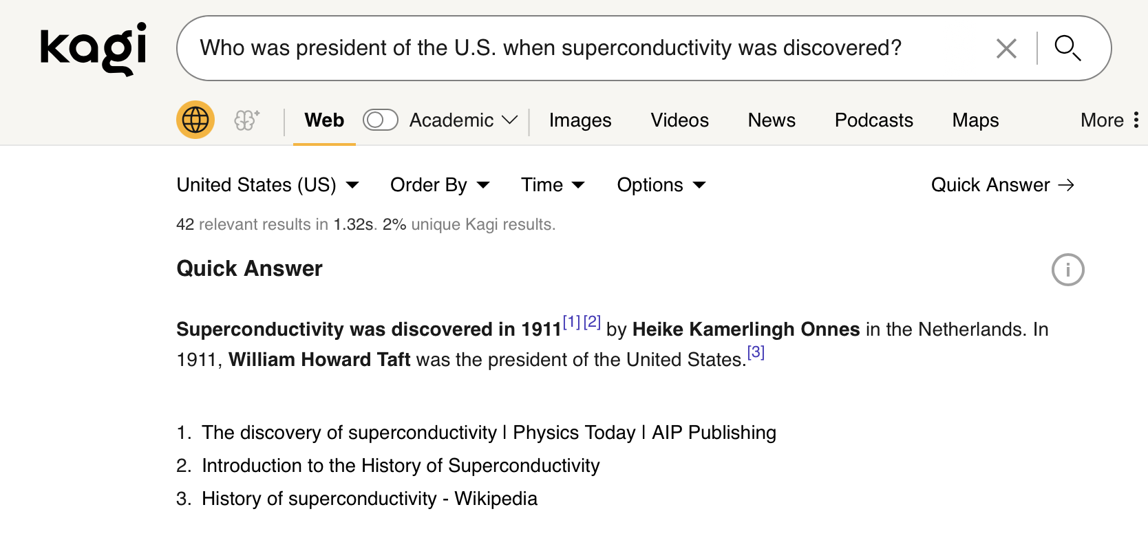
It is also worth noting that LLM enabled search indeed opens door to search engines accepting a whole new universe of queries that did not exist before (because they were not possible/ would need to do multiple queries/ dig into results). Queries like the one above, or this one:

I think it is cool that we are able to do this in a search engine today (caveat: when it is accurate, which for now is still a consideration). But obviosuly we are not ready for this yet and we will be rolling back some automation around this until we figure out what to do. Kagi is a built around a culture of experimentation and this was one such experiment.
I guess this is an invitation for discussion how to design a proper search UX around these building blocks so that Kagi is indeed offering a unique, useful and a carefully designed search experience.