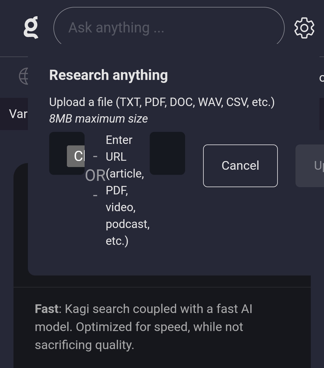
On mobile (Kiwi Browser on Android 13) the modal for uploading a file or URL to the research assistant gets squished/compressed/mangled and therefore partially overflows to the right side of the screen.
You can replicate it by:
- Going to the research assitant page/screen.
- Clicking on the upload file button

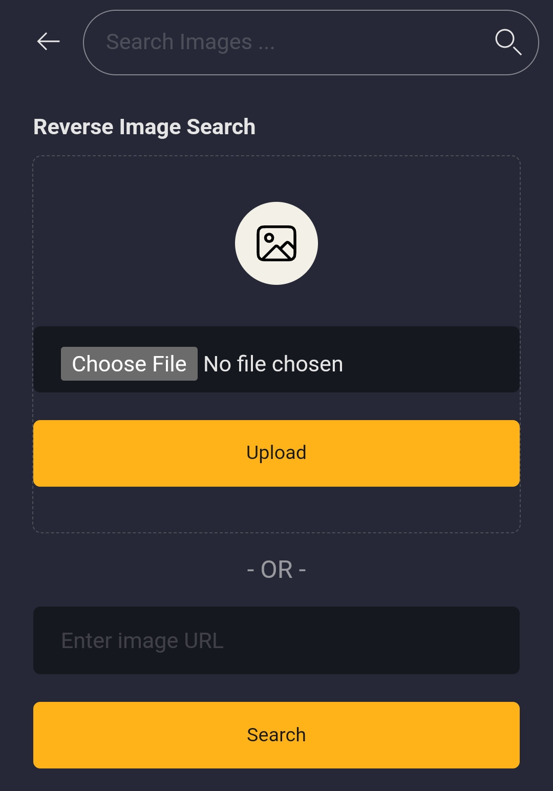
I would expect for the modal to use more vertical space rather than being squished. Something like the reverse image search form:
