What does your feature entail? What is it for? How will it affect existing workflows or user experience?
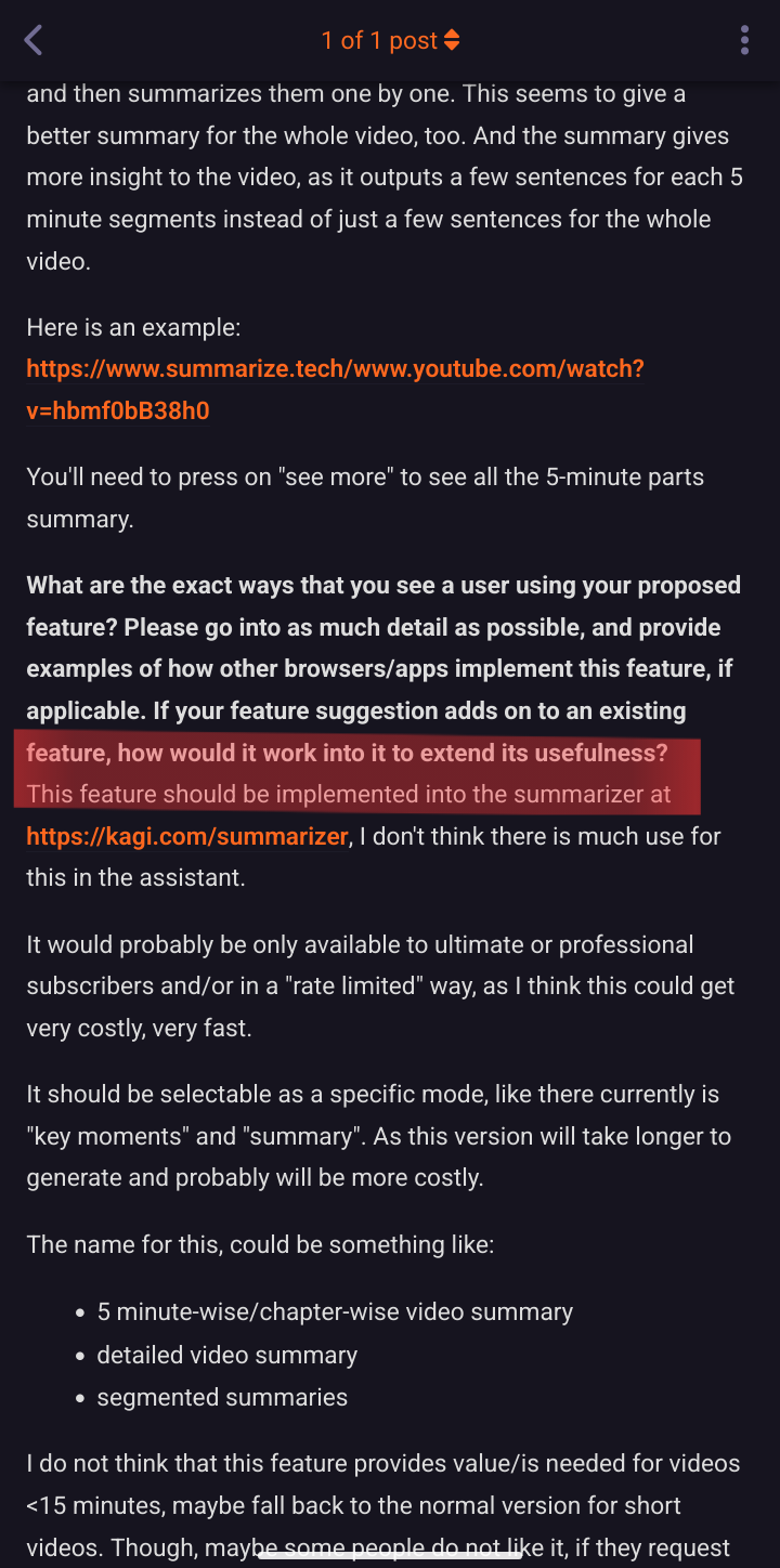
Is it possible to give these new headers on kagifeedback.org a bit more space or make them larger (font size) or make them a bit shorter (string length)?
I can't really see where the titles begin and where the user submitted text begins, at least it's hard to tell.

What are the exact ways that you see a user using your proposed feature? Please go into as much detail as possible, and provide examples of how other browsers/apps implement this feature, if applicable. If your feature suggestion adds on to an existing feature, how would it work into it to extend its usefulness?
Better readability of user submissions on kagifeedback.org (like this one, as I added a new line at the top of this field, which makes it a bit more readable for me)