Currently, when a user accesses Kagi settings, they arrive at the General settings page, but there's no real indication that there are many more settings available. There is a menu button to access the other settings, but it's non-obvious that it is different from e.g. the Control Center (the icon is different, but arguably even less "settings"-related than the slider icon of the Control Center).
To improve this, I suggest making three changes:
Label the menu. Next to the menu icon, add some text, such as "Settings", "More Settings", "Navigation", or the like.
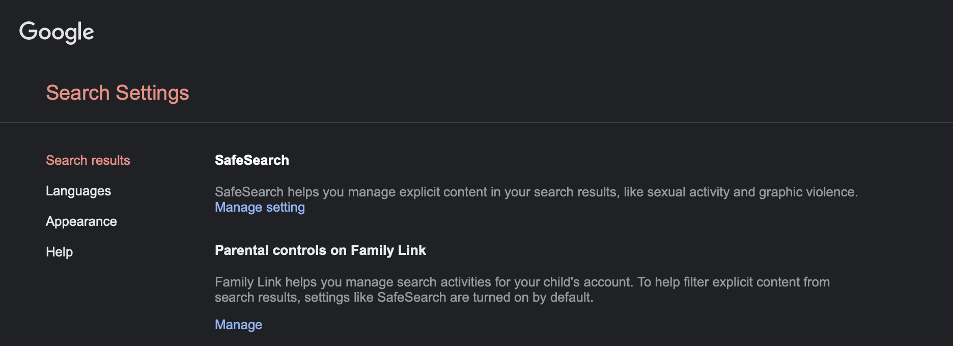
If the viewport is wider than, say, 800px, display the navigation at all times, in a sidebar. As an example, here's what the Google search settings page looks like:

Display a header on the page indicating what settings category is being viewed, since currently this is only visible if you open the navigation menu. (If the sidebar is visible, this isn't as important, since the currently selected page is highlighted.)