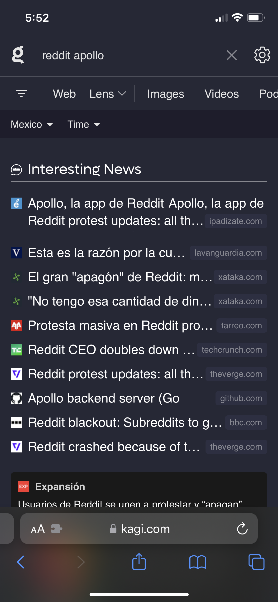
As a Kagi user, whenever I perform a search using the Kagi News feature from a smartphone, I would like to see 2 rows of text for each item inside the "Interesting News" section (currently only 1 row is visible), so I can get a better idea of what each news article is about. (Please refer to attached image with a mockup proposal applied to the first result.)
