I've given it a few days to get over any "change is bad" instinct, so here's my considered review of these changes. It turned into an essay, sorry!
Per-result context menu
First, the plus icon is incorrect - this communicates adding something, and not a context menu. I mean, even your own AI says that!
Now you might argue that you're adding a search filter, or doing a new search with the filter. Technically correct, but (despite any Futurama memes) this doesn't matter in UX clarity. It's confusing and therefore wrong.
Plus should be changed to the standard three dots or hamburger icon.
Second, I'd suggest this menu should allow opening the link in the full summarizer page, as I can't be the only one who find a lot of utility in being able to request different levels of detail. You already offer this in your videos page (more about summarise later).
Domain info icon
I can see the logic of changing to something communicating settings - I assume your metrics or user studies showed that people didn't realise they could use the widget to change their settings. Or perhaps you've just copied Chrome, since that's what most are using.
However, the icon is too busy to allow layering other icons on top. Let's look at these three:
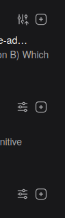
How many would notice at a glance that one of these is different? Making it vertical is a nice idea, but it's too subtle to work, especially given that it's in the periphery of the user's gaze.
In addition to the settings affordance, you're communicating two different things with the icon - Kagi's rating (e.g. too many trackers) and the user's personalisation. I'd suggest replacing the icon with an up/down arrow in the same way you currently do for pins, for the same reason - the user has already figured out the interface and made their choice. This allow you to continue using colour to communicate domain info (although you could similarly argue the user has already made their choice about trackers and/or AI slop).
Also, the setting page still refers to the old shield-based icons.
Summarize
Oh dear. I thought it'd been removed at first, because the link is camouflaged:

Same font face, size, colour, etc. Nothing to indicate that it's a button.
I'd suggest moving the link to the right, perhaps with a right-facing triangle 🢒 icon that turns into a down-facing triangle 🢓 icon when opened - like how html summary elements are styled. This would also allow closing the summary again. The link should also have some colour and/or border/underlining to distinguish it from the snippet text.
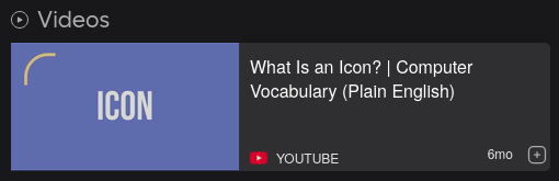
Also, videos in the main search do not currently have any summarizer link:
Thanks for coming to my TED Talk.
