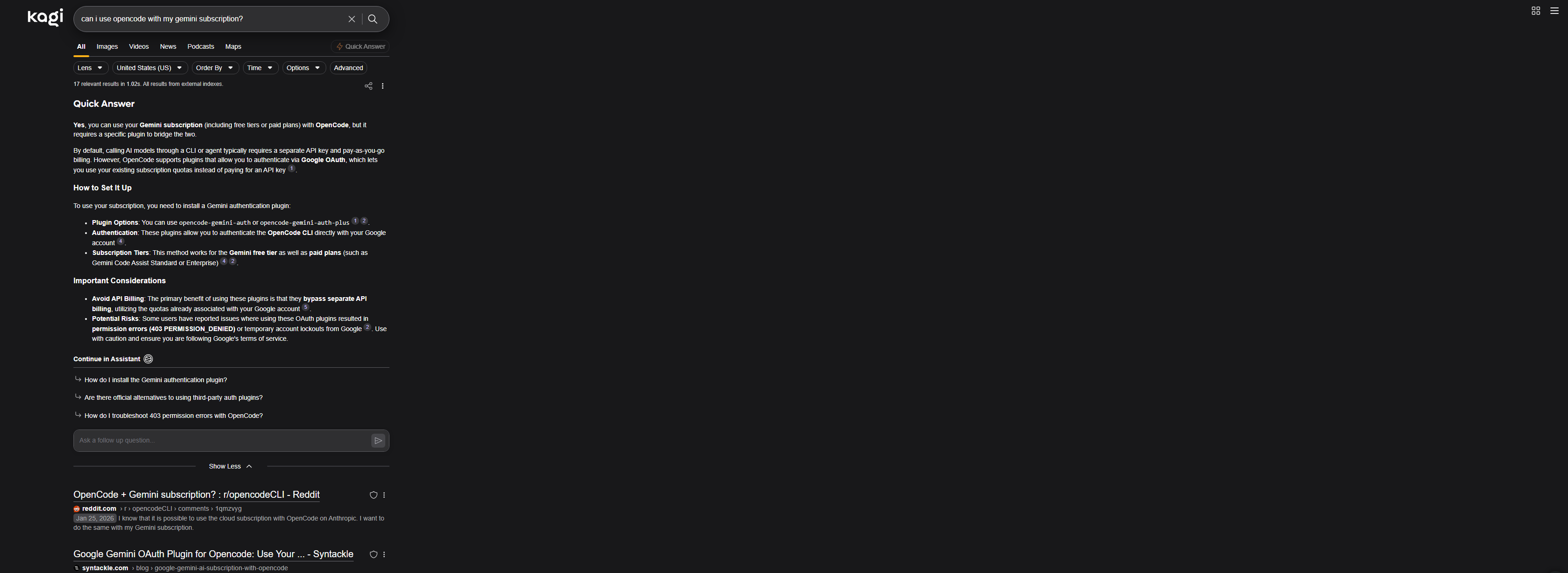
When viewing the Kagi search results on a large monitor, the results end up alllllll the way on the left. This feels very odd as I have to a.) turn my head heavily to see the results, but also b.) creates a strong UX imbalance on the page. I think ideally it would be more center-aligned? or perhaps find a way to make it more responsive for larger sized screens?
I think I explained how it was used in the description (it's a UX enhancement not a flow change).


