One of Kagi's strongest promises is personalizing results. But these features not sufficiently visible or accessible. They should supported with a UX that makes managing boosted/blocked sites a near effortless and natural part of searching/browsing performing research on the web.
Boosting or blocking domain now requires too much energy, as does determining if a given result comes from a boosted or blocked domain.
The following are an effort toward making personalization front and center in the UI without adding undo visual noise.
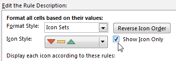
a) The results list should provide a visual indicator for each result if it is from a blocked/normal/boosted site. This should be available without having to open the orb. Possibly the orb could be blocked/normal/boosted colored as magenta/yellow/green. Or maybe use icon's like Excel's: 
b) Keyboard shortcuts should be provided for moving a the site of a result between blocked,normal,boosted. Blocking a site should not remove it immediately from the results list. However, re-executing a query (possibly by refreshing the page) from whose result list sites have been blocked should no longer return pages from those sites.
c) an option to show blocked results should be provided, allowing user to quickly review what they'ev previously lbocked, and possibly choose to unblock a previously blocked site.
d) navigation to the bulk block list tool should take at most 2 clicks. Probably should have a link to it on the "Control Center" fly-out.